BED BATH & BEYOND
Registry Onboard & Create
I was the lead designer on the Registry Onboard & Create and Registry Reimagine Project. The goal was to create an easy sign up process, and get to know the registrants so we can provide a personalized customized registry experience.
My role
Design Lead
Design Strategy
Competitive Audit
User Research
Design Handoff
Team
Product Manager
Junior Designer
Engineer
BA
QA
Device
App ios
Mobile/ Desktop Web
Duration
2 weeks
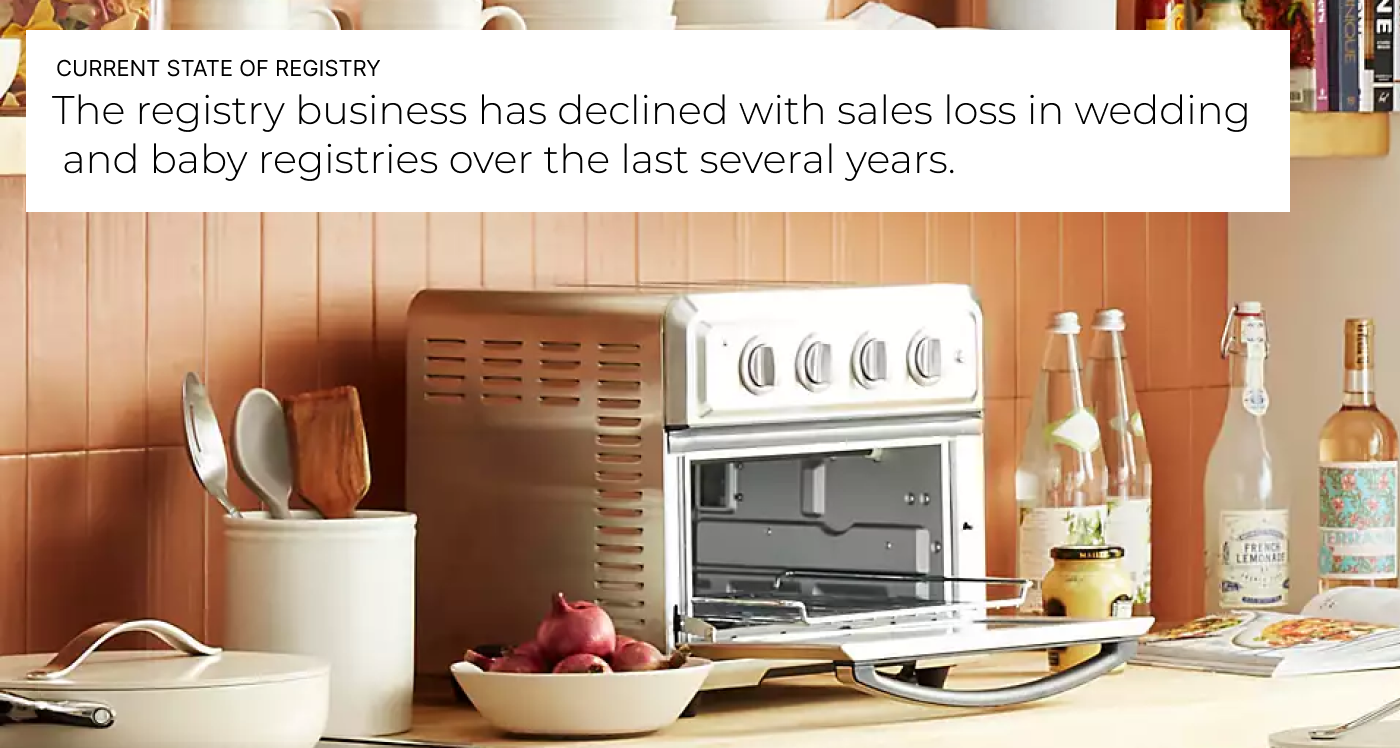
Problem
Overall registry business is down. The whole registry business needs to be reimagined to be competitive in the market.
Store creates are down and there was drop off in online create. Customers are having issues.
”Never again will I register here. My guest and myself have had nothing but issues.” -registrant at Bed Bath & Beyond.
Create completion rate is 52%. The current create is 10 fields form and is long and cumbersome.
Usability Research
Baymard provided Bed Bath feedback that during Baymard’s large-scale usability testing, many test users felt overwhelmed and intimidated when they were presented with a screen that displayed a high number of form fields.
Baymard also provided feedback there is a lack in disclosure on the number of steps users can be expecting from the registry sign up process. It can get discouraged to users who are just getting started. Essentially, users get loss or discouraged with a multi steps process if they cannot get an overview of the process.
It is recommended to make the registry sign up process as easy as possible for users.

Users
Looking to Upgrade
Living together or could have been married before. You have your own stuff that is a bit worn. Looking for upgrades. Things that you couldn’t afford. Looking for a lot of nice to haves. Looking for more money and experiences. Probably want to personalize their experience.
Example Personas
Have lived together and consolidated household
Older, with household items purchased independently
Not first marriage, has their own style/items
Merge between budget and extravagant shopper
Just starting out
Couples who do not have anything. They have hand me down products. Consolidating and rethinking everything. Figuring out each other's long term style. Figuring out where they will live.
Example Personas
Doesn’t live together or have not lived together long
Registrant, living in a Small Spaces and just starting out
Younger couple, first marriage
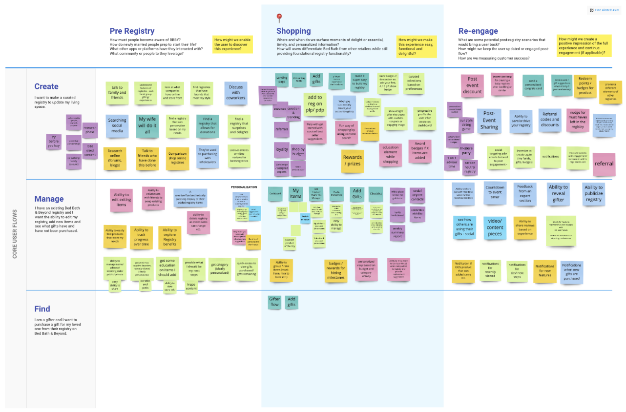
Workshop
At this time, we were reimagining all the registry. This was part of the larger workshop session to reimagine registry. This session helped the team and I think about the bigger picture of registry while also focusing on create in parrel to this brainstorm
Comparative analysis
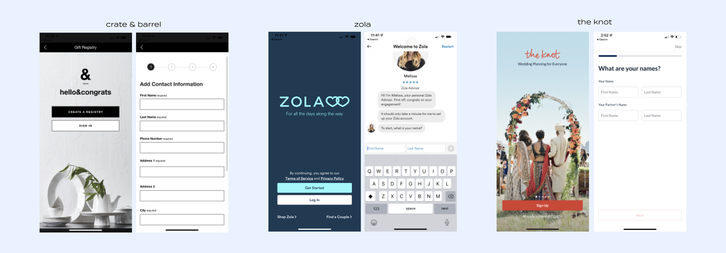
I did comparative analysis to look at what the competitors were doing for the landing page and create in the app. I looked at a bunch of landing pages and create flows for Crate & Barrel, Target, Zola, The Knot, The Bump, Macy’s, Pottery Barn and more. Crate & Barrel, Zola and the Knot strategies stood out to me.
Crate & Barrel provides a landing page with the quick ability to create, find or sign in. They have a nice benefits component that lists the benefits using lifestyle photography. The overall create. The create is a simple 3 step create with clear steps.
Zola provides a landing page with the quick ability to create, find or sign in. The benefits are not listed. There is no lifestyle photography. The create is done through chat.
The Knot provides a landing page with the quick ability to create or sign in. You swipe to view the benefits. The landing page uses beautiful inclusive photography. The create is a simple and has multiple forms, but is focused on a few form fields at a time.
Overall, all registries have strong features to make it easy to create a registry.
Lo Fi Explorations
I worked closely with my product manager to determine how we would approach the user experience. Based on the competitive, the workshop session and customer pain points I came up with a vision on how we would approach the create. We walked our stakeholders, engineers, devs and team through our vision.
Strategy
Create sign up was optimized for form conversion through minimal number of fields. 2 fields vs 10 fields currently
Traditional form format with straightforward brand voice
Additional data collection post - for Info that was suppressed up front
Quiz to capture personalized data
Infuse fun, celebratory in the success screen to surprise, delight and connect more emotionally. Easy access to the dashboard.
User Testing
We conducted user testing and 10 out of 10 users preferred a quick form with data capture so they could start building the registry quicker and have a personalized registry experience..
Hi Fi Designs
After creating the wires, I created hi fi designs and prototypes for the below. I reviewed with my PM then we walked our stakeholders, engineers, devs and team through our vision.
Revised Strategy
1. Landing page and onboarding with quick access to benefits in one easy swipe
2. Create with 2 form fields from 10 previously
3. Additional data collection post - for Info that was suppressed up front
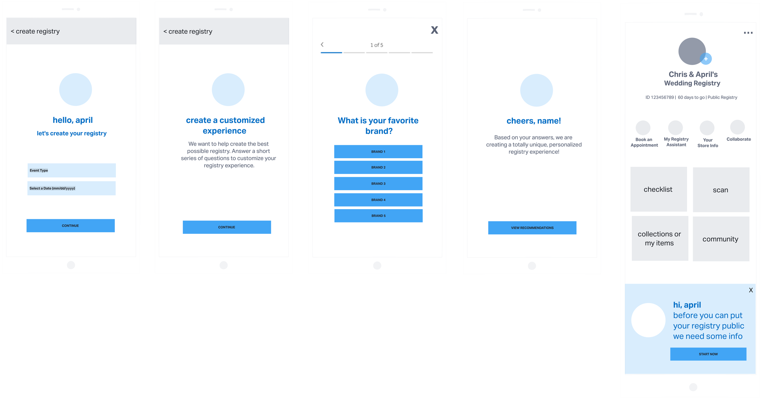
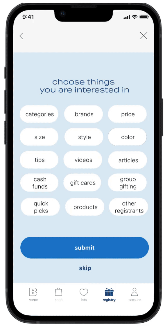
4. Quick data capture sheet instead of lengthy quiz. I realized that having multi page quiz after the create was making the create flow longer than it needed to be. Creating a quick data capture sheet where users can select things they are interested in was more impactful to keep the create short. We can use this data to drive machine learning. I also further explored the progressive profiling to capture data that we did not capture upfront in the create.
5. Fun, celebratory success screen with easy access to the dashboard
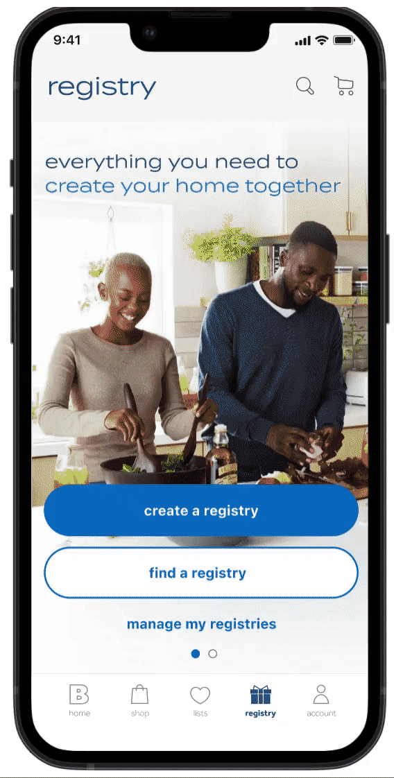
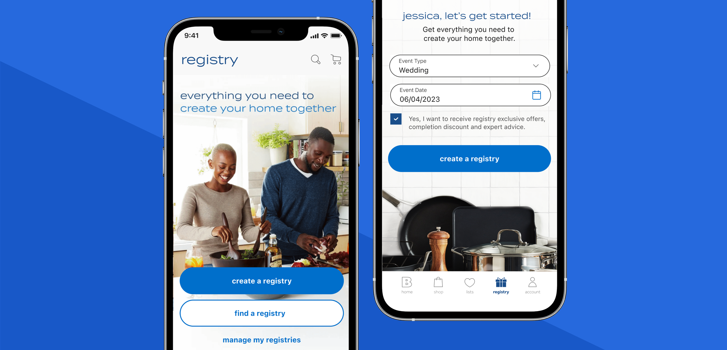
Registry landing & onboarding
We wanted to promote all registry types such as wedding, baby, housewarming and college upfront. This provided clear visibility into what registry types we had. Registrants can drill into the specific registry type.
Lifestyle photography showing people in these photos helped evoke the feeling of happier with Bed Bath & Beyond.
Showing these inspirational images as well as key benefits will help registrants make a quick decision to create a registry with Bed Bath & Beyond.
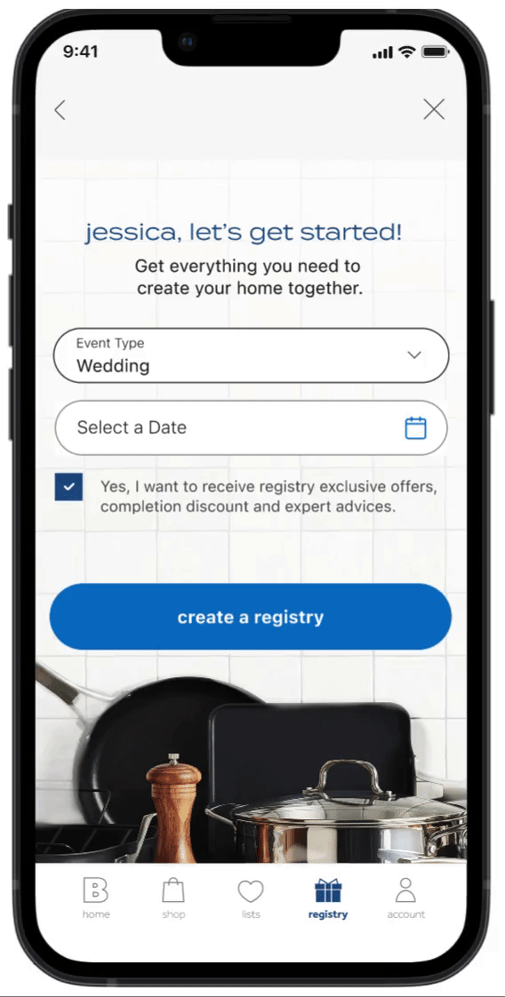
Registry Create
Registrants want to quickly create their registry without any friction. The current app and web create is long and make registrants fill in a lot of information upfront. There has been data that there is a lot of drop off during the create.
Having limited 2 fields upfront and gathering the rest of the data post create with progressive profiling was an approach that got the registrant focus on building and managing their registry sooner in the process.
Data capture and success
Currently, we have a quiz and there is a lot drop off on create. I simplified the approach to have a single page with data capture.
Capturing these tags will help the business understand the registrants wants and needs and surface personalized content that is relevant to the user.
Once the registrants creates the registry, they will get a success screen that will congratulate them for getting started. We wanted to infuse fun, celebratory in the success screen to surprise, delight and connect more emotionally. The registrant can then explore the dashboard and other pages and start building.
Outcome
This feature is launching this fall. I don’t have the data yet.
The goal is
Increase in activate creates
Increase in overall registry engagement
Increase average registry value