2014
Harper’s Bazaar Redesign
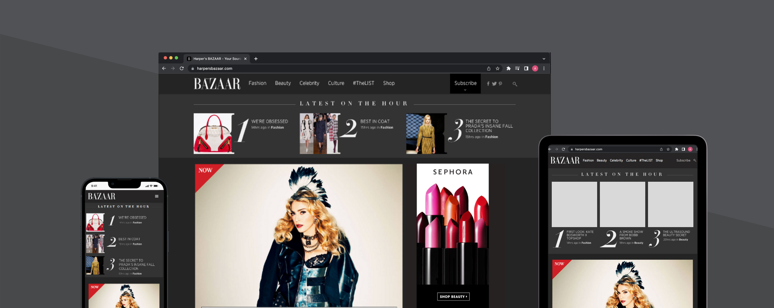
I was one of 2 designers on this responsive redesign project in 2014. We worked very closely with my Creative Director at the time. Note this project is not live anymore.
My role
Interaction designer
Strategy
Competitive Audit
Design Handoff
Team
Creative Director
Designer
Dev
BA
QA
Device
Mobile/ Desktop/Tablet Web
Duration
6 weeks
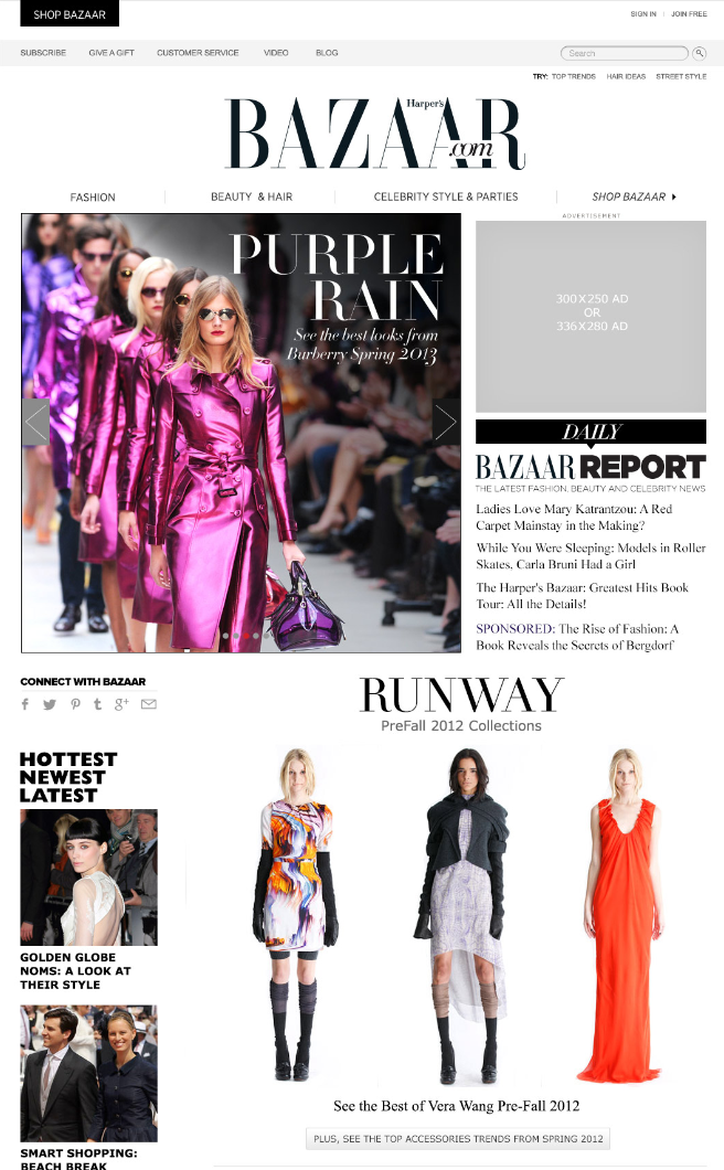
Old home Page Issues
The old home page and core pages look and feel was outdated and site was not responsive.
Background
In 2013, Hearst Digital was moving their sites over to a responsive framework…therefore Harper’s Bazaar.com the site needed a responsive redesign.
How might we…create a more streamlined site for Harpersbazaar.com that adheres to the brand standards and guidelines
Objective
Create a responsive framework that maintains the overall brand style and brand
Users
Bazaar's audience comprises women ranging from their late twenties to their early sixties, predominantly in professional roles. They are culturally discerning, enjoy travelling and are prepared to spend money on bespoke luxury experiences.
Outcome
Updated look and feel of page templates (including more white space on its pages) and the ability to share images and articles on social media platforms more easily,
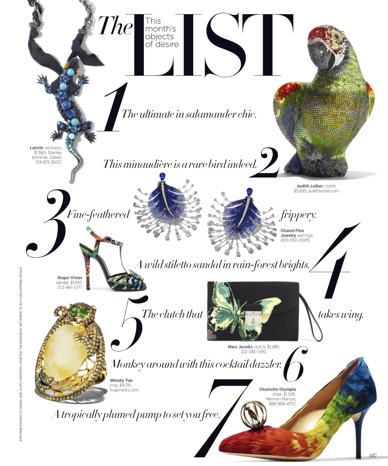
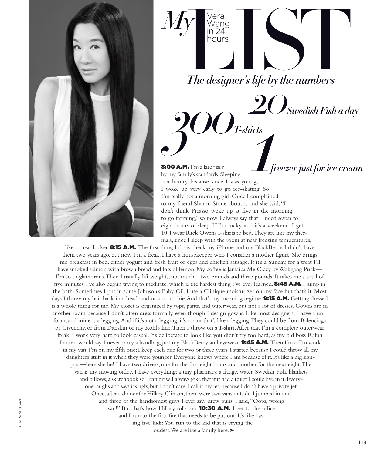
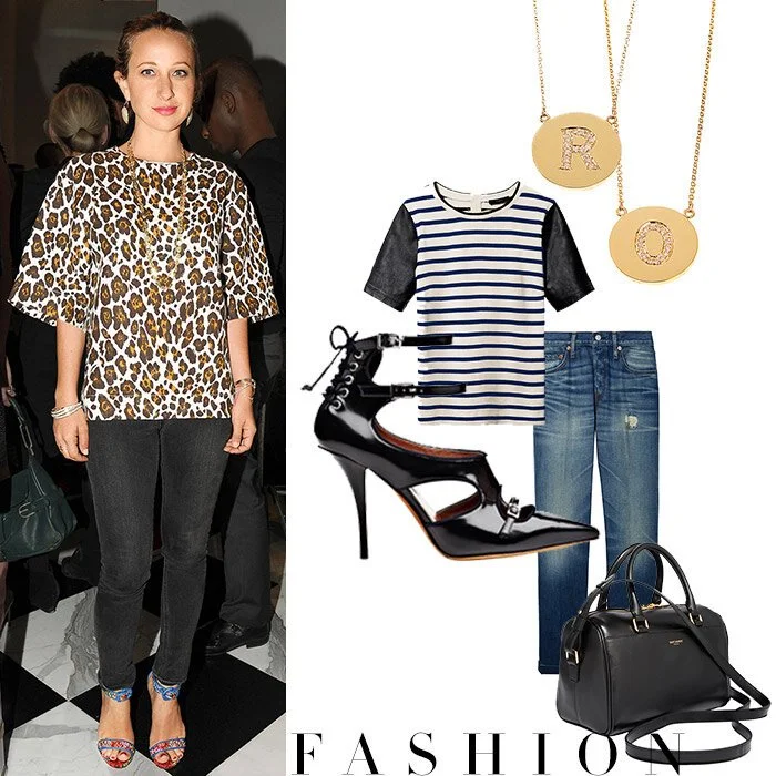
Introduced an editorial feature called #TheList that will run daily on its Web site and will highlight top trends culled by the magazine’s editorial staff — everything from the newest fall fashion runway looks to makeup tips.
Redesign allowed advertisers to publish topical content about a developing story that can run alongside editorial content and pages where advertisers can post short videos, curate social media posts or sponsor photo galleries.
2014 Harpersbazaar.com appeared in a New York Times Article view article
2014 Harpersbazaar.com was a Webby Honoree in the Magazine Category
The redesign was live from Fall of 2013 to the end of 2014. After a year of this new approach, Hearst Digital Brands decided to go with a newsfeed type of approach for all its brands.
Inspiration
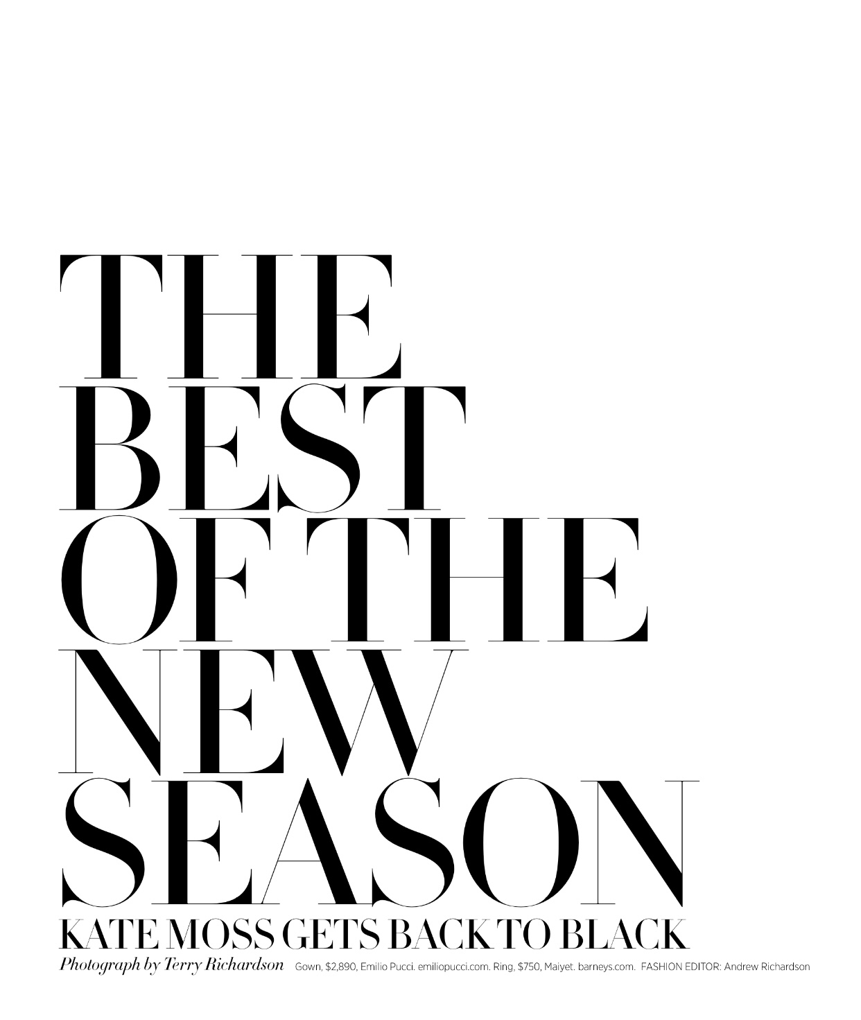
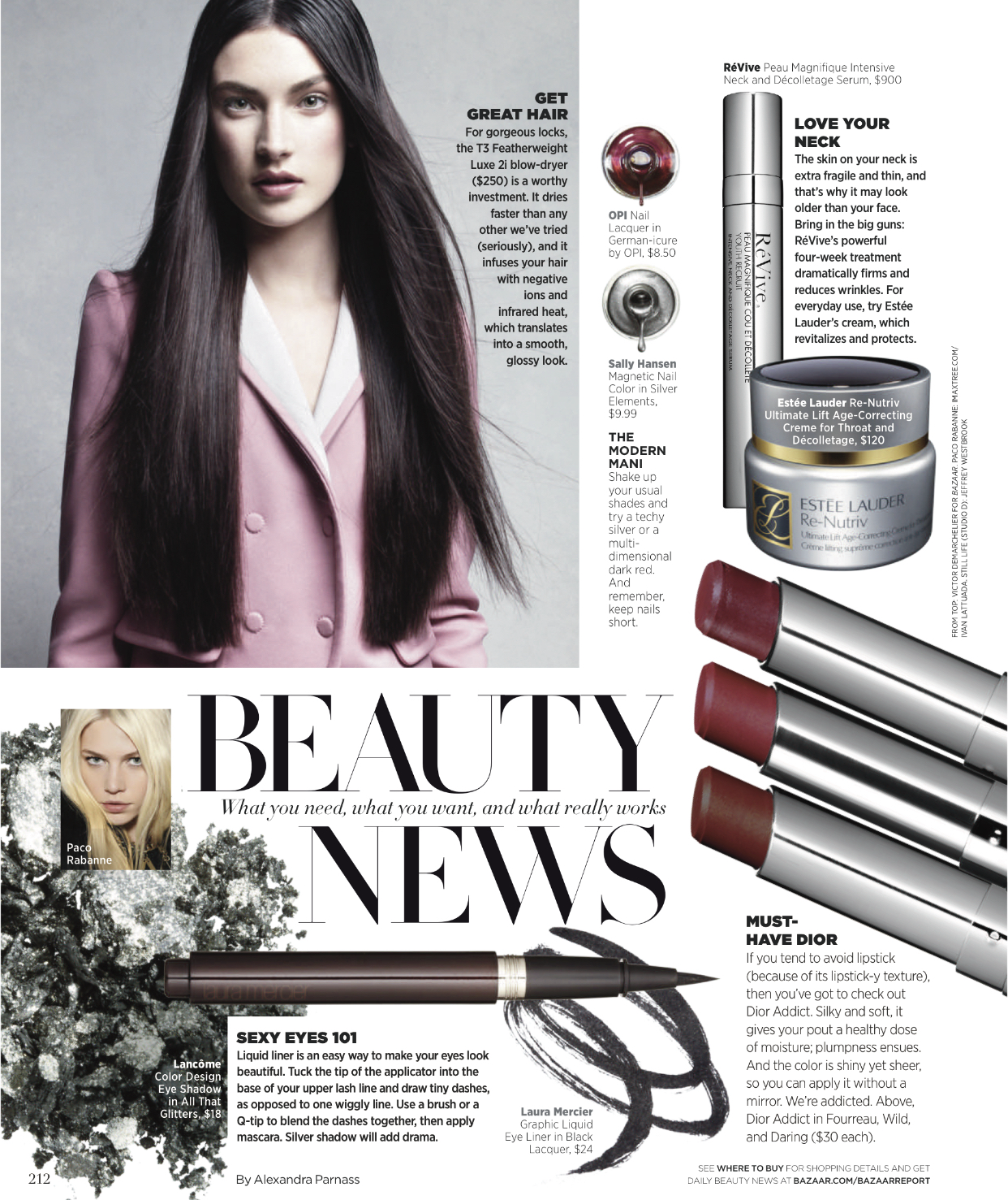
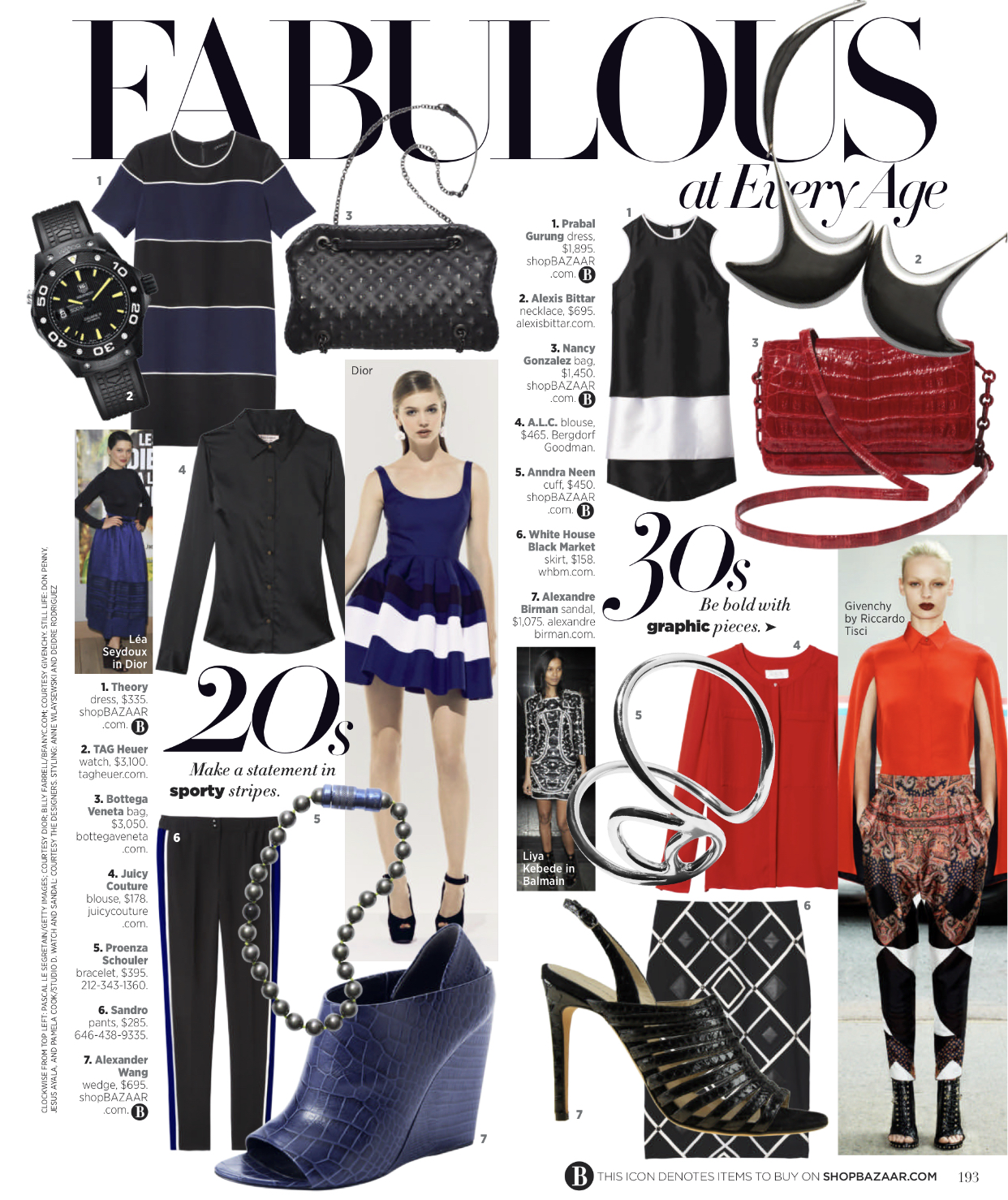
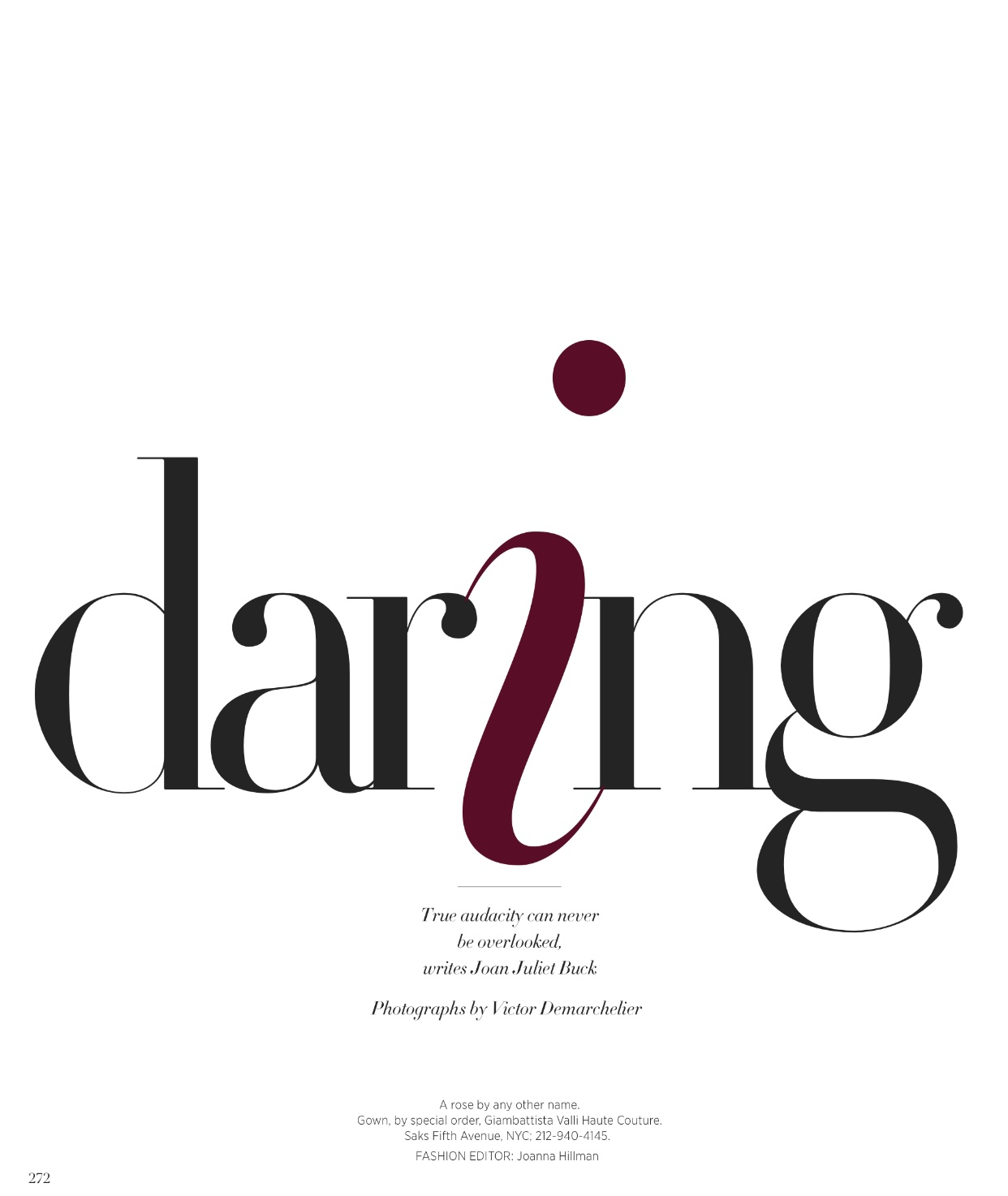
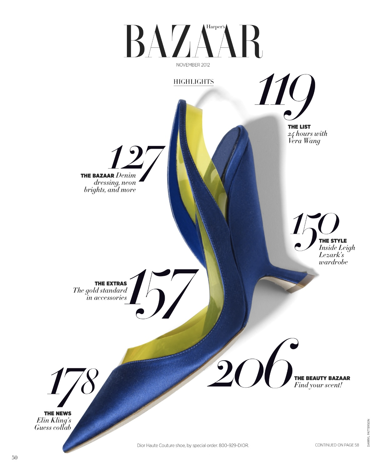
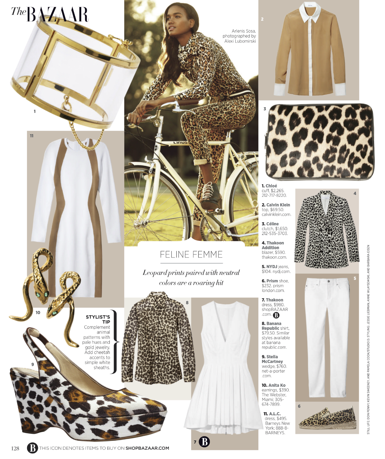
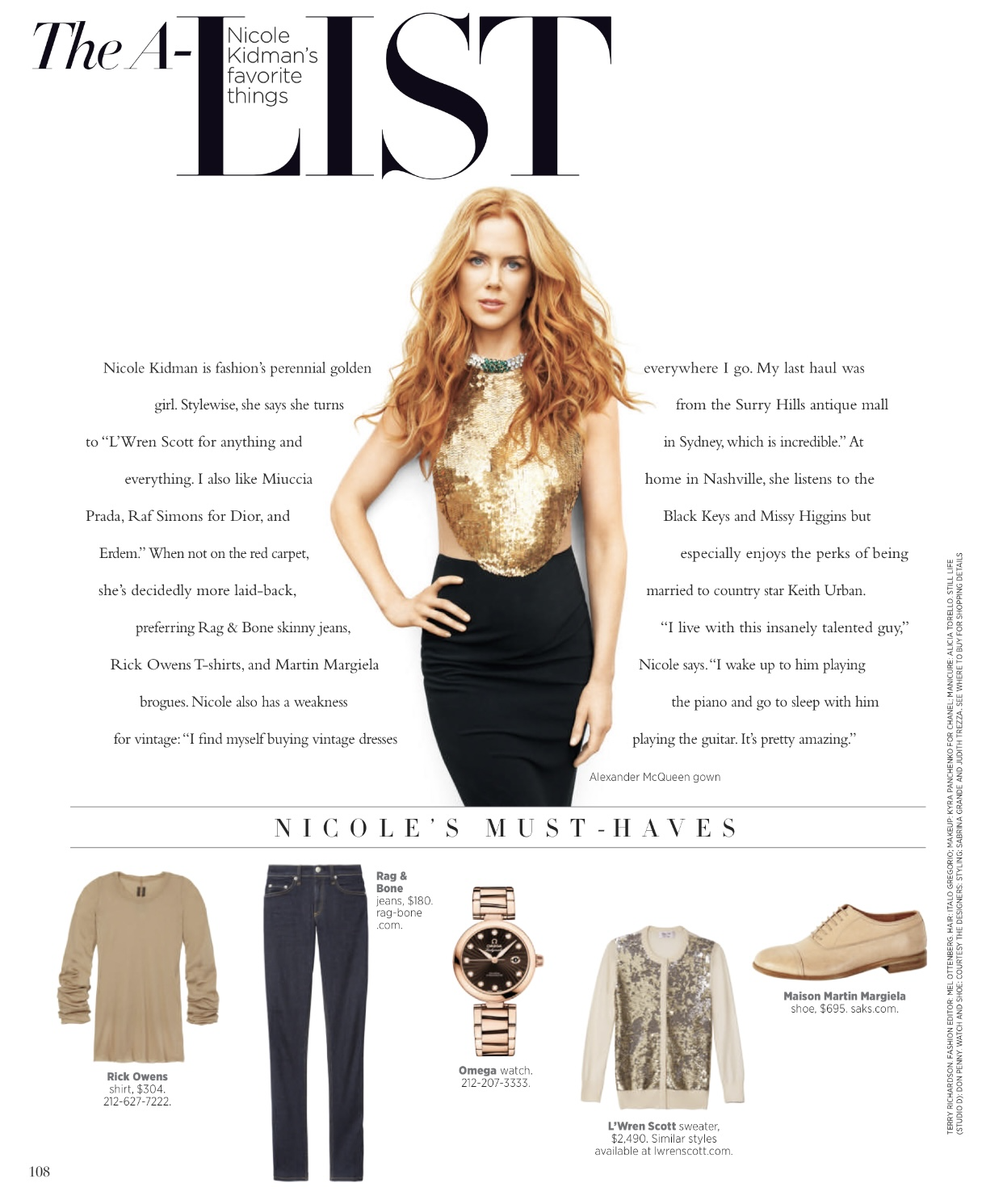
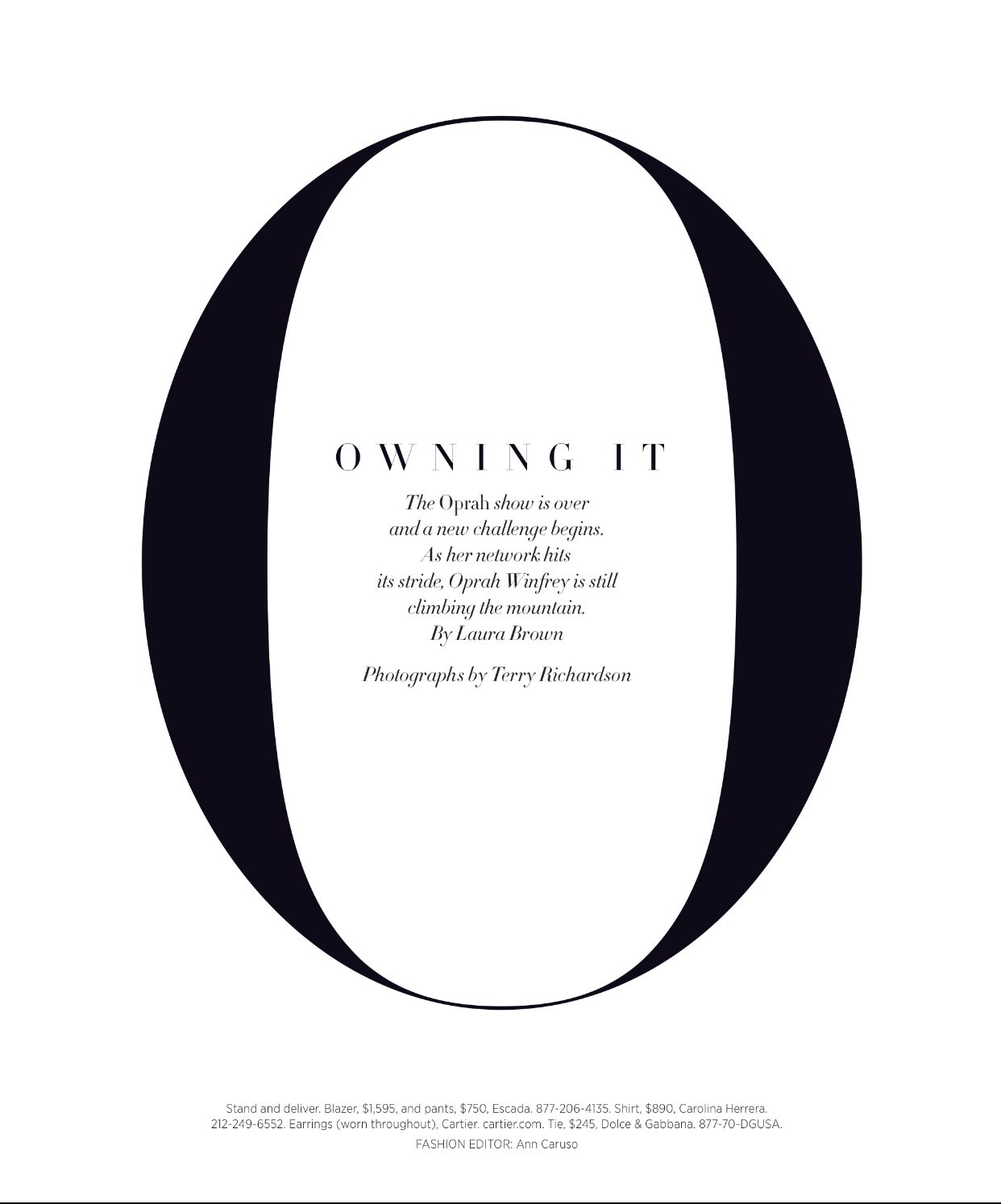
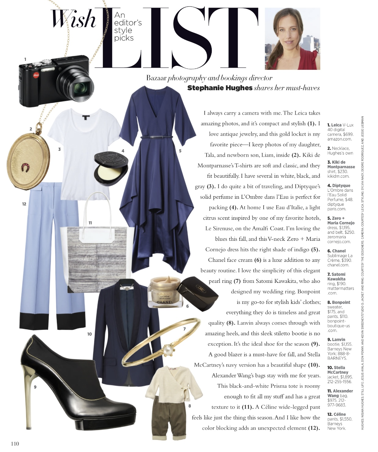
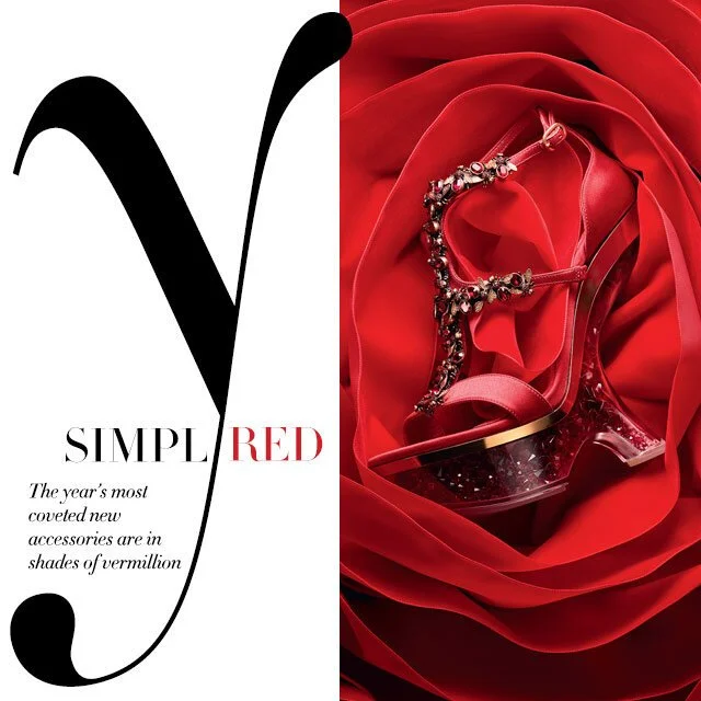
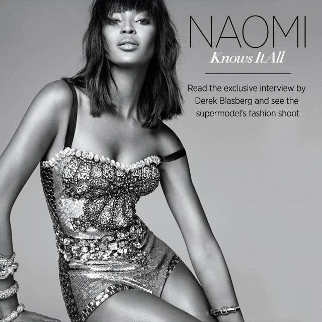
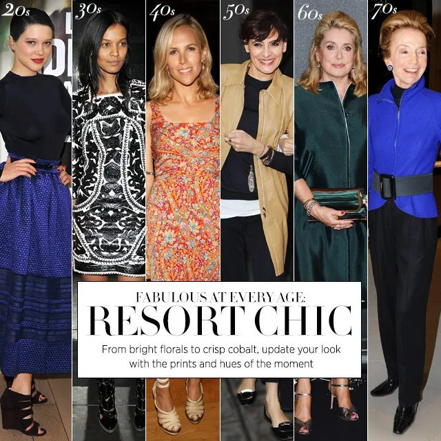
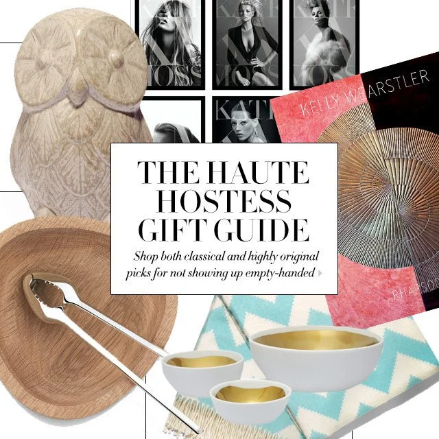
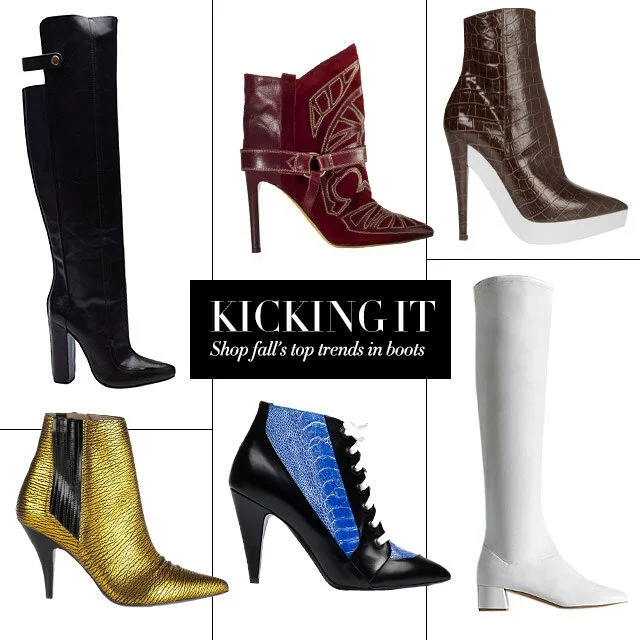
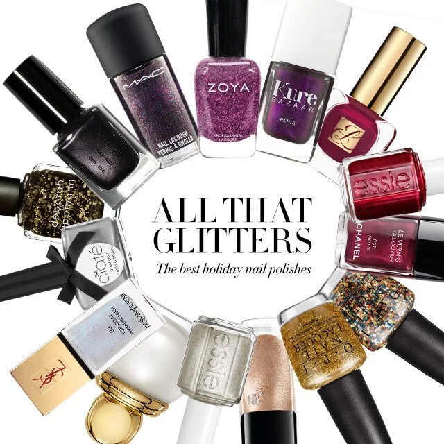
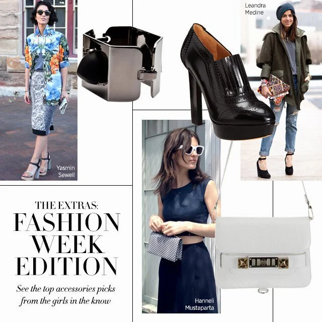
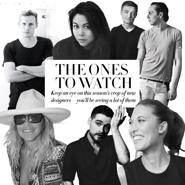
I looked to the magazine layouts for inspiration on the look and feel from the bold photography that is a mixture of street style and high end fashion as well the clean typography and use of white space.
Wires
Created high level wires of the home page to outline the vision
Home Page Redesign Solution
Overall the page strategy is to provide a highly editorialized page so the user feels they are experiencing the same content as the magazine but in a digital form
Create opportunities for ads to be integrated with the page
Use font choices and treatments to mimic the look and feel of the magazine.
Tthe page is a mix of the hourly news, moment of the day, street style, Bazaar daily, The list, looks and additional editorial stories to make of mix of things that fashionista would be interested in.
Click video to view home page design. This was live in 2014 and no longer live.
Article Design
Overall I wanted the article to have a similar experience as the online magazine.
In this template I needed to account for different image sizes at the top of the page
Use white space and clean typography from the magazine so the design has the same aesthetic
Quick ability to view the photos from this article where you would be taken to an immersive gallery experience
View comments
View shares and have the ability to share
Quick ability to link to other articles
Sign up for the newsletter
Click video to view the article template. This is no longer live.
Epic design
Create a template that has quick access to various components in a shopping guide
Created various components for different types of components. Ex. Hero Story, Video, Two Tout, List and grid
Editors can then build the guide with the components they need
Editors can rebuild the component
The components would live in a CMA
Gallery Design
Create a template that has easy ability
View and share photos in gallery
Quickly view photos In other galleries
Site composites
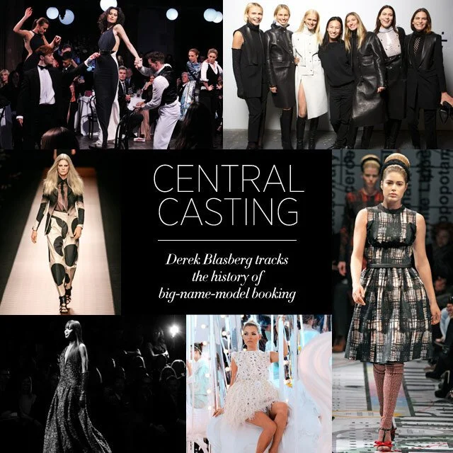
Thes are composites I did for the new design and some for the old site. The typography, silo of the images and design choices very inspired by treatments in the magazine.
